

From a historical perspective, international trade has grown remarkably in the last couple of centuries. After a long period characterised by persistently low international trade, over the course of the 19th century, technological advances triggered a period of marked growth in world trade (the 'first wave of globalisation'). This process of growth stopped, and was eventually reversed in the interwar period; but since the Second World War international trade started growing again, and in the last decades trade expansion has been faster than ever before. Today, the sum of exports and imports across nations is higher than 50% of global production. At the turn of the 19th century this figure was below 10%.
In the last couple of decades, transport and communication costs have decreased across the world, and preferential trade agreements have become more and more common, particularly among developing countries. In fact, trade among developing nations (often referred to as South–South trade), more than tripled in the period 1980–2011.
Free international trade is often seen as desirable because it allows countries to specialize, in order to produce goods that they are relatively efficient at producing, while importing other goods. This is the essence of the comparative advantage argument supporting gains from trade: exchange allows countries to “do what they do best, and import the rest”.
Available empirical evidence shows that while trade does lead to economic growth on the aggregate, it also creates ‘winners and losers’ within countries – so it is important to consider the distributional consequences of trade liberalization.
I. Empirical View
I.1 International trade in the long run
International trade has grown remarkably in the last couple of centuries
The following visualisation presents a compilation of available trade estimates, showing the evolution of world exports and imports as a share of world output (you can read more about aggregate output measures in our entry on GDP).
As we can see, until 1800 there was a long period characterised by persistently low international trade – globally the sum of exports and imports never exceeded 10% before 1800. This then changed over the course of the 19th century, when technological advances triggered a period of marked growth in world trade – the so-called 'first wave of globalisation'. Until 1913, worldwide trade grew by more than 3% annually.
The first wave of globalisation came to an end with the beginning of the First World War, when the decline of liberalism and the rise of nationalism led to a slump in international trade. In the chart we see that there was a sizeable reduction on international trade in the interwar period.
After the Second World War trade started growing again. This new – and ongoing – wave of globalisation has seen international trade grow faster than ever before. Today the sum of exports and imports across nations is higher than the value of 50% of the global production.
World trade over 5 centuries (1500-2011)1

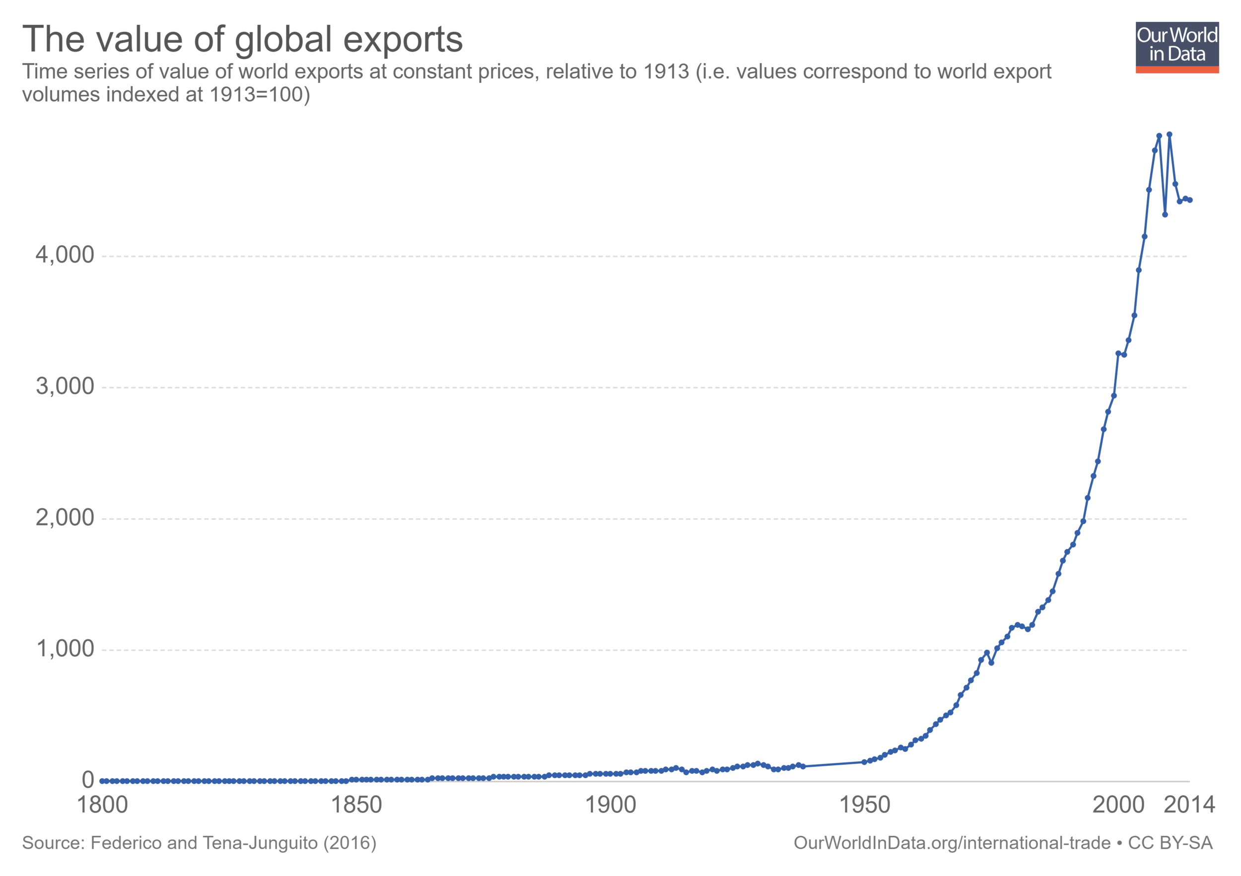
The value of global exports has grown constantly over the last two centuries
Throughout the last two centuries, the rate of growth increased constantly – trade grew faster and faster. This remark can be best appreciated in the following visualization, presenting estimates of world exports for the period 1800-2014. The data comes from Federico and Tena-Junguito (2016)2 and the vertical axis is in constant prices (i.e. world exports have been indexed, so that values are relative to the value of exports in the year 1913). As it can be seen, trade growth roughly followed an exponential path in the period 1800-2010. In fact, growth in exports has been so large in the last century that the interwar slump is almost not visible when we use this scale.
You can click on the option marked 'Linear' to change into a logarithmic scale.
Before the 19th century trade was strongly linked to colonialism
Over the early modern period, transoceanic flows of goods between empires and colonies accounted for an important part of international trade. The following visualizations provides a comparison of intercontinental trade, in per capita terms, for different countries.
As we can see, intercontinental trade was very dynamic, with volumes varying considerably across time and from empire to empire.

Trade within Europe was very important in the 'first wave of globalization'
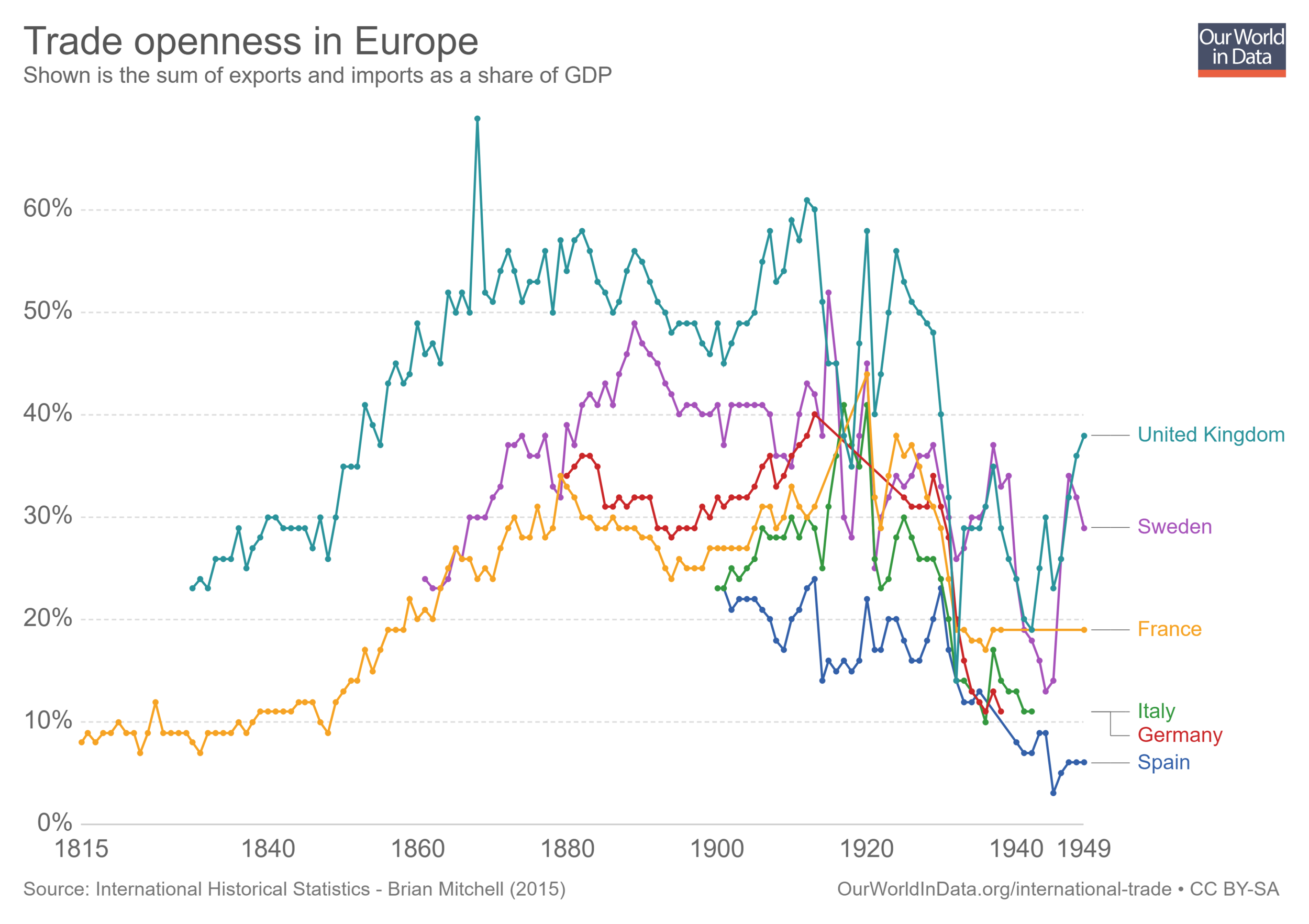
The following visualization provides details regarding trade patterns for specific countries during the first wave of globalization. It shows the most common measure of international integration: trade openness, measured as the sum of exports and imports, expressed as a share of GDP.
The data shows that over the course of the 19th century, international trade became increasingly important across many nations. Yet we can also see that in some countries, trade was already very important before the 19th century. The Netherlands is a case in point: the so-called Dutch Golden Age of the 17th century stands out exceptionally in the graph.
By comparing the series labelled 'Europe (total)' and 'Europe (total) without intra-Europe trade', we can also see that the 'first wave of globalization' implied a substantial growth in trade within Europe.
European integration collapsed in the interwar period
In the previous visualization we highlighted the important process of economic integration that took place in Europe during the 19th century. Here we focus on the impact that the First and Second World Wars had on this process.
The following graph shows exports and imports as a share of GDP for a selection of European countries, during the period 1815-1949. As can be seen, economic integration collapsed across European countries in the interwar period.
To emphasize the point above, the following graph, from Broadberry and O'Rourke (2010)4, shows the evolution of three indicators measuring integration across markets – specifically commodity, labor, and capital markets (see source for details on each indicator). The graph shows a clear interwar slump in integration across all markets.
Migration, financial integration and trade openness, 1880-1996 (indexed to 1900 = 100) – Cambridge Economic History Vol. 2) 5

I.2 The 'second wave of globalization'
The second half of the 20th century saw increasing trade across the world
We have already pointed out that after the Second World War, global trade openness started growing even faster than before the First World War. Here we show, country by country, how trade has been expanding across the globe in the last few decades.
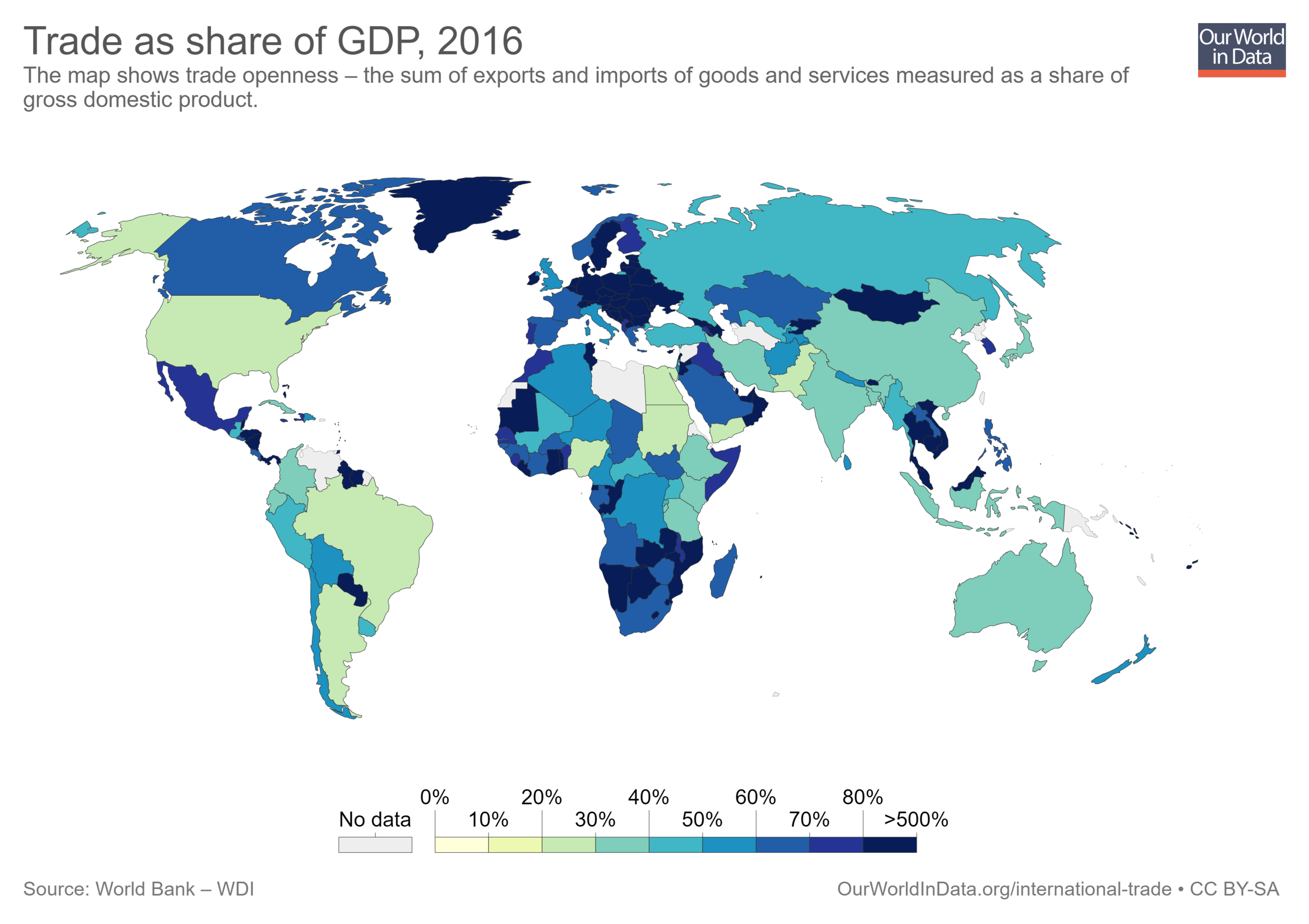
The visualization below presents a world map of trade openness. It shows the sum of a country's exports and imports, divided by that country's GDP. You can explore country-specific time series by clicking on the 'Chart' option on top of the map. As can be seen, trade has changed over time differently in each country, but in the vast majority of countries there is a marked upward trend.
Reductions in trading costs have contributed to the recent expansion of trade
The world-wide expansion of trade after the Second World War was largely possible because of reductions in transaction costs stemming from technological advances, such as the development of commercial civil aviation, the improvement of productivity in the merchant marine, and the democratisation of the telephone as the main mode of communication. The visualization below shows how, at the global level, costs across these three variables have been going down since 1930.

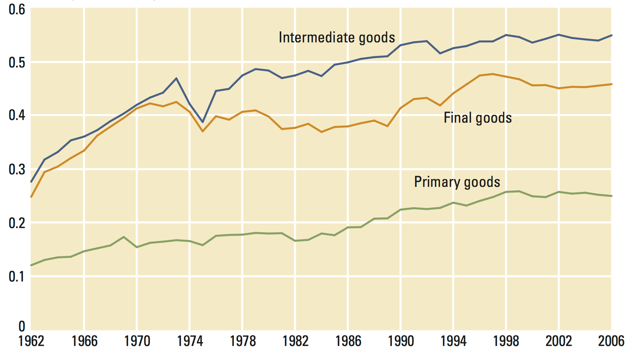
The 'second wave of globalization' has been characterized by increasing intra-industry trade
The 'first wave of globalization' was characterized by inter-industry trade. This means that countries exported goods that were very different to what they imported – England exchanged machines for Australian wool and Indian tea. This changed in the 'second wave of globalization'. Intra-industry trade (i.e. the exchange of broadly similar goods and services) has increased substantially since the Second World War – France now both imports and exports cars to and from Germany.
The following visualization, from the UN World Development Report (2009), plots the fraction of total world trade that is accounted for by intra-industry trade, by type of goods. As we can see, intra-industry trade has been going up for primary, intermediate and final goods.
This pattern of trade is important because the scope for specialisation increases if countries are able to exchange intermediate goods (e.g. auto parts) for related final goods (e.g. cars).
Share of intraindustry trade by type of goods – Figure 6.1 in UN World Development Report (2009)
What is traded around the world?
The Observatory for Economic Complexity (OEC), at the MIT, produces fascinating interactive visualizations of international trade patterns. The following chart shows a breakdown of world exports by product, since the 1960s. You can visit the OEC website for an interactive version of this chart, including figures in absolute terms (exports and imports by products in current US dollars).
In the figure below, we can see that oil, machinery and electronics, have been traditionally large trading sectors since the 1960s. However, electronics have grown particularly fast, while the importance of oil has declined. Today, electronics account for a larger share of world exports, and are only second to machinery.
Composition of world exports by product type (Standard International Trade Classification) – OEC (2016)

I.3 Recent developments in bilateral and regional trade
Bilateral trade is more frequent than unilateral trade
Most countries that export goods to a country, also import goods from the same country. The following visualization, from Helpman et al. (2007)6 provides evidence of this. In this figure, all possible country pairs are partitioned into three categories: the top portion represents the fraction of country pairs that do not trade with one-another; the bottom portion represents those that trade in both directions (they export to one-another); and the middle portion represents those that trade in one direction only (one country imports from, but does not export to, the other country). As we can see, the majority of trading relationships are bilateral.
Another important conclusion from the figure below is that growth in international trade throughout the second half of the 20th century took place specifically through growth in bilateral exchanges. Nevertheless, today there are still many countries that do not trade with each other.
Distribution of country pairs by type of trade (bilateral, unilateral, or non-trading), 158 countries, 1970-1997 – Figure 1 in Helpman et al. (2007)7

South-South trade is becoming increasingly important
The following visualization, from the UN Human Development Report (2013), shows the share of world merchandise trade that corresponds to exchanges between emerging and advanced economies. Specifically, this chart plot series for South-South trade (i.e. trade between emerging economies), South-North trade (i.e. trade between advances and emerging economies) and North-North trade (i.e. trade between advanced economies). For the purpose of this graph, the 'North' corresponds to Australia, Canada, Japan, New Zealand, the United States and Western Europe.
This figure shows that, as a share of world merchandise trade, South–South trade more than tripled over 1980–2011, while North–North trade declined. China has been a key driver of this dynamic: the UN Human Development Report (2013) estimates that between 1992 and 2011, China's trade with Sub-Saharan Africa rose from $1 billion to more than $140 billion.
Share of world merchandise trade by type of trade (North-North, South-South, South-North), 1980-2011 – Figure 2.1 in UN Human Development Report (2013)

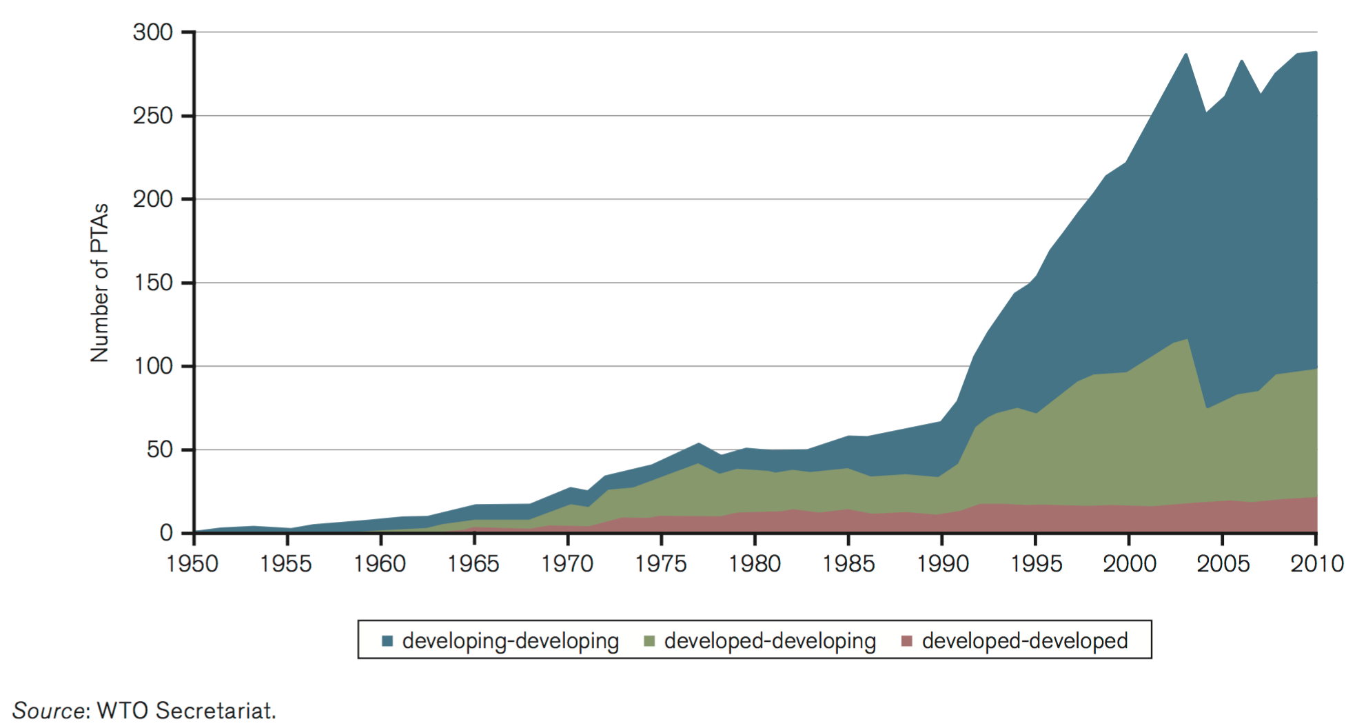
The majority of preferential trade agreements are between emerging economies
The last few decades have not only seen an increase in the volume of international trade, but also an increase in the number of preferential trade agreements though which exchanges take place. A preferential trade agreement is a trade pact that reduces tariffs between the participating countries for certain products.
The following visualization shows the evolution of the cumulative number of preferential trade agreements that are in force across the world, according to the World Trade Organisation (WTO). These numbers include notified and non-notified preferential agreements (the source reports that only about two-thirds of the agreements currently in force have been notified to the WTO), and are disaggregated by country groups.
This figure shows the increasingly important role of trade between developing countries (South-South trade), vis-a-vis trade between developed and developing countries (North-South trade). In the late 1970s, North-South agreements accounted for more than half of all agreements – in 2010, they accounted for about one quarter. Today, the majority of preferential trade agreements are between emerging economies.
Number of preferential trade agreements in force by country group, 1950-2010 – Figure B1 in WTO Trade Report (2011)
Trading patterns have been changing quickly in middle income countries
The increase in trade among emerging economies over the last half century has been accompanied by an important change in the composition of exported goods in these countries. To provide a concrete example of this, the following visualization plots the share of food exports in each country's total exported merchandise. These figures, produced by the World Bank, correspond to the Standard International Trade Classification, in which 'food' includes, among other, live animals, beverages, tobacco, coffee, oils and fats.
Two important patterns emerge from the data. First, there has been a substantial decrease in the relative importance of food exports since 1960s in most countries (although in the last decade it has gone up slightly globally). And second, this decrease has been largest in middle income countries, particularly in Latin America. Colombia is a notable case in point: food went from 67% of merchandise exports in 1986, to 9% in 2013.
Regarding levels, as one would expect, in high income countries food still accounts for a much smaller share of exports than in most developing countries.

II. Correlates, Determinants and Consequences
II.1 Explaining trade patterns
Countries tend to export what would be cheap to produce under autarky
Most trade theories in the economics literature focus on sources of comparative advantage. Broadly speaking, the principle of comparative advantage postulates that all nations can gain from trade if each specializes in producing what they are relatively more efficient at producing, and import the rest: “do what you do best, import the rest”.
For countries with relative abundance of certain factors of production, the theory thus predicts that they will export goods that rely heavily in those factors: a country typically has a comparative advantage in those goods that use more intensively its abundant resources. Under this theory, Colombia exports bananas to Europe because it has comparatively abundant tropical weather. Under autarky, Colombia would find it cheap to produce bananas relative to e.g. apples.
The empirical evidence suggests that the principle of comparative advantage does help explain trade patterns. Bernhofen and Brown (2004)8, for instance, provide evidence using the experience of Japan. Specifically, they exploit Japan’s dramatic nineteenth-century move from a state of near complete isolation to wide trade openness.
The following graph shows the price changes of the key tradable goods after the opening up to trade. It presents a scatter diagram of the net exports in 1869 graphed in relation to the change in prices from 1851–53 to 1869. As we can see, this is consistent with the theory: after opening to trade, the relative prices of major exports such as silk increased (Japan exported what was cheap for them to produce and which was valuable abroad), while the relative price of imports such as sugar declined (they imported what was relatively more difficult for them to produce, but was cheap abroad).

Financial institutions affect trade
Conducting international trade requires that producers in exporting countries have access to external capital, such as credit.
The following scatter plot, from Manova (2013)10 shows the correlation between levels in private credit (specifically exporters’ private credit as a share of GDP) and exports (average log bilateral exports across destinations and sectors). As can be seen, financially developed economies – those with more dynamic private credit markets – typically outperform exporters with less evolved financial institutions.
Other academic research has shown that non-economic institutions are also important determinants of trade. Country-specific language knowledge for example, has been shown to promote foreign relative to domestic trade (see Melitz 200811).
Bilateral exports and countries’ financial development – Figure 2 in Manova (2013)

Trade diminishes dramatically with distance
The resistance that geography imposes on trade has long been studied in the empirical economics literature, typically under the label of 'gravity trade models'. The main conclusion in this literature is that trade intensity is strongly linked to geographic distance.
The following visualization, from Eaton and Kortum (2002)13, graphs 'normalized import shares' against distance. Each dot represents a country-pair from a set of 19 OECD countries, and both the vertical and horizontal axis are expressed on logarithmic scales (1995 data). The 'normalized import shares' in the vertical axis provide a measure of how much each country imports from different partners (see the paper for details on how this is calculated and normalised), while distance in the horizontal axis corresponds to separation between central cities in each country (see the paper and references therein for details on the list of cities). As we can see, there is a strong negative relationship. Through econometric modelling, the paper shows that this relationship is not just a correlation driven by other factors: their findings suggest that distance still imposes a significant cost on trade.
Import share versus distance, country pairs for a set of 19 OECD countries, 1990 – Figure 1 in Eaton and Kortum (2002)

The fact that trade diminishes with distance is also corroborated by data of trade intensity within countries. The following visualization shows, through a series of maps, the geographic distribution of French firms that export to France's neighboring countries. The colors reflect the percentage of firms which export to each specific country. As we can see, the share of firms exporting to each of the corresponding neighbors is largest close to the border. The authors also show in the paper that this pattern holds for the value of individual-firm exports – trade value decreases with distance to the border.
Percentage of firms which export in France, by importing country, 1992 – Figure 2 in Crozet and Koenig (2010)15

II.2 Trade and economic performance
How is trade related to economic growth?
A useful first step to establish whether trade and economic growth are somehow related is to search for correlations. The following figure, from Ventura (2006)16, plots the growth rates of these two variables against each other, using pooled data from various regions and periods. Each dot in this plot corresponds to growth in a specific world region during a specific time period. There are in total seven regions (Western Europe, Western Offshoots, Eastern Europe and former USSR, Latin America, Asia and Africa) across four periods (1870–1913, 1913–1950, 1950–1973 and 1973–1998). As can be seen, there is a strong positive correlation between growth in per capita income and growth in trade.
This relationship is only a correlation, and does not imply causation – countries differ in many aspects other than trade openness, and hence we cannot attribute the observed differences in growth to differences in trade. In other words, trade is 'endogenous': countries whose incomes are high for reasons other than trade, may trade more.
The academic economics literature has tried to address the issue of endogeneity in a number of ways. In a seminal paper, Frankel and Romer (1999) suggest using geography as a proxy for trade. The idea is that geography is fixed, and mainly affects national income through trade – so if we observe that a country's distance from other countries is a powerful predictor of economic growth (after accounting for other characteristics), then it must be because trade has an effect on economic growth. Following this logic, the authors suggest that there is a strong positive causal effect of trade on economic growth. This, of course, does not prove that trade is the only driver of growth – indeed, the related findings from Rodrik, Subramanian and Trebbi (2004)17, suggest that trade matters through its interaction with other institutions, like the rule of law. For more literature on this topic see Alcala and Ciccone 200418 and the references therein.
Growth of income and trade, data pooled across regions and periods – Figure 4 in Ventura (2006)

How does trade affect the distribution of incomes?
A core prediction of the above-mentioned 'comparative advantage' theories of trade is that, through liberalization and economic integration, the relative prices of goods will change. In its simplest form, the prediction is that countries that open up to trade will see the relative prices of some goods go up, while others will go down. It is clear, then, that even such simple and stylized prediction implies that trade creates winners and losers, depending on what different people produce and consume, and what factors of production they can contribute to the economy.
A growing empirical literature in economics has tried to address the question of whether trade liberalization helps specifically the incomes of those at the bottom of the distribution. Topalova (2010) finds that the 1991 Indian trade liberalization, had a negative effect on poverty reductions: rural districts in which production sectors were more exposed to liberalization, experienced slower decline in poverty and lower consumption growth. The author provides evidence suggesting that the reason for this was the fact that those who were worse off struggled to relocate to other sectors, in order to reap the benefits from trade. Here again we see how trade interacts with region-specific characteristics that determine the consequence of trade.
Other studies, using data from other countries, have also found that trade may have important distributional consequences. Autor, Dorn and Hanson (2013)20, for example, study the consequences for the US of rising Chinese imports in the period 1990-2007. The visualization below shows a scatter plot of cross-regional exposure to rising imports, against changes in employment. Each dot on this graph corresponds to a different area within the US ('commuting zones', CZs); the vertical axis shows the percent change in manufacturing employment for working age population; and the horizontal axis shows what the authors predict to be the per-worker exposure of the different areas to rising imports (depending on industrial composition, etc.). As can be seen, there is a negative correlation. In fact, the authors go beyond, and suggest that rising Chinese imports in the period 1990-2007 caused higher unemployment, lower labor force participation, and reduced wages in local labor markets that house import-competing manufacturing industries (see the paper for details on the empirical strategy used to determine causality).
While both of the studies mentioned above suggest a negative impact of trade on income inequality, they do not prove that e.g. India or the US were on the whole made worse-off because of trade. In fact, there are other studies, such as Fajgelbaum and Khandelwal (2016)21, that show that trade does favour specifically the poor. The aspect via which trade benefits the poor is consumption – they find that the relative change in prices produced by trade typically favors the poor, who concentrate spending in more traded sectors. This is at the heart of the classic trade-off in public economics: efficiency sometimes comes at the cost of equity.
Change in manufacturing employment by commuting zones in the US, 1990-2007 – Figure 2b in Autor, Dorn and Hanson (2013)

III. Data Sources
International Historical Statistics (by Brian Mitchell)
Data: Aggregate trade (current value), bilateral trade with main trading partners (current value), and major commodity exports by main exporting countries. No data on trade as share of GDP is readily available.
Geographical coverage: Countries around the world
Time span: Long time series with annual observations – from 19th century up to today (2010)
Available at: The books are published in three volumes covering more than 5000 pages.23 At some universities you can access the online version of the books where data tables can be downloaded as ePDFs and Excel files. The online access is here.
Data from the 19th century onwards for countries around the world is available in the International Historical Statistics (IHS). These statistics – originally published under the editorial leadership of Brian Mitchell (since 1983) – are a collection of data sets taken from many primary sources, including both official national and international abstracts. This is quite an extensive dataset going back as far as 1891, however, currencies include kronen, schillings etc. which would further need to be looked into as to how to convert to US$ and the excel file download also needs formatting before it can be suitably workable.
Penn World Tables
Data: Real and PPP-adjusted GDP in US millions of dollars, national accounts (household consumption, investment, government consumption, exports and imports), exchange rates and population figures.
Geographical coverage: Countries around the world
Time span: from 1950-2011 (version 8.1)
Available at: Online here
Feenstra, Robert C., Robert Inklaar and Marcel P. Timmer (2015), "The Next Generation of the Penn World Table" forthcoming American Economic Review, available for download at www.ggdc.net/pwt
Correlates of War Bilateral Trade
Data: Total national trade and bilateral trade flows between states. Total imports and exports of each country in current US millions of dollars and bilateral flows in current US millions of dollars
Geographical coverage: Single countries around the world
Time span: from 1870-2009
Available at: Online at www.correlatesofwar.org
This data set is hosted by Katherine Barbieri, University of South Carolina, and Omar Keshk, Ohio State University. Authors note in their 'COW Trade Data Set Codebook': "We advise against using the dyadic data file to produce any national or global totals, based on aggregations of the partner trade."
World Bank - World Development Indicators
Data: Trade (% of GDP) and many more specific series: trade in merchandise, trade in services, trade in high-technology, trade in ICT goods, trade in ICT services – always exports and imports separately. Also export and import value index and volume index.
Geographical coverage: Countries and world regions
Time span: Annual since 1960
Available at: Online at http://data.worldbank.org
UN Comtrade
Data: Bilateral trade flows by commodity
Geographical coverage: Countries around the world
Time span: 1962-2013
Available at: Online here
Bilateral trade flows can be sorted by goods or services, monthly or annually, with choice of classification (including HS codes, SITC, and BEC). Data is likely to be very time consuming to collate as there is no bulk data download unless a user has a premium site license.
UNCTADstat
Data: Many different measures, including trade by volumes and value
Geographical coverage: Countries around the world
Time span: For some series, data is available since 1948 - mostly annual, sometimes quarterly.
Available at: Online here
UNCTADstat reports export and import data between 1995 and 2016 but primarily to different regional groupings than any one country, so it's probably not best suited to comparing country-to-country bilateral flows.
Eurostat - COMEXT
Data: Trade flows (also by commodity)
Geographical coverage: Europe (EU and EFTA)
Time span: Mostly since 1988
Available at: Online here
Also, the Eurostat website 'Statistics Explained' publishes up-to-date statistical information on international trade in goods and services.
World Trade Organization - WTO
Data: Many series on tariffs and trade flows
Geographical coverage: Countries around the world
Time span: Since 1948 for some series
Available at: Online here
The WTO offers a bulk download of trade datasets which can be found here. Amongst these are annual WTO merchandise trade values and WTO-UNCTAD-ITC annual trade in services datasets. The former is available from 1948 - 2017, workable, with very little additional formatting needed. However, observations are country groups, such as the EU28, the BRICS etc. rather than country-by-country values. Otherwise, the WTO's Statistics Database (SDB) has extensive time series on international trade, by country with their trading partners. Again, trading partners are primarily restricted to country groupings rather than individual nations.
CEPII database on the World Economy
Data: Many different data sets related to international trade, including trade flows by commodity geographical variables, and variables to estimate gravity models
Geographical coverage: Countries around the world
Time span: Some series go back to the 1990s.
Available at: Online here
CEPII's Bilateral Trade Historical Series: New Dataset 1827-2014 provides extensive dyadic trade data, with 97 percent of the observations from 1948 to today drawing on the IMF's Direction of Trade Statistics (DOTS) dataset.
NBER-United Nations Trade Data, 1962-2000
Data: Export and import values and volumes by commodity
Geographical coverage: Single countries
Time span: 1962-2000
Available at: Online here
This data is also available from the Center for International Data. Bilateral trade data value estimates are very close to that of the World Bank's imports of goods and services time series.
Smaller historical trade data sets
Data on UK bilateral trade for the time 1870-1913 was collected by David S. Jacks. It is downloadable in excel format here.
For the time 1870-1913 21,000 bilateral trade observations can be found in Mitchener and Weidenmier (2008) – Trade and empire, available in the Economic Journal here.
Data on UK, Germany, France, and US between mid-19th to 20th Century can be found here.
Data on Developing Country Export - in 1840, 1860, 1880 and 1900 - by John Hanson is available here.
Data on trade between England and Africa during the period 1699-1808 is available on the Dutch Data Archiving and Networked Services. It was compiled by Marion Johnson.
Footnotes
All data sources are shown in the chart:
For consistency, the 62 countries used in Klasing and Milionis are used to calculate the world trade to GDP ratio for the period 1950-2011. The list can be found in Appendix A2 of their paper.
Penn World Tables Version 8.1 can be found here.
Mariko J. Klasing, Petros Milionis, Quantifying the evolution of world trade, 1870–1949, Journal of International Economics, Volume 92, Issue 1, January 2014, Pages 185-197, ISSN 0022-1996, doi: 10.1016/j.jinteco.2013.10.010. Online here.
Antoni Estevadeordal, Brian Frantz and Alan M. Taylor (2003) – The Rise and Fall of World Trade, 1870–1939. The Quarterly Journal of Economics (2003) 118 (2): 359-407. doi: 10.1162/003355303321675419. Online here.
Notes on the calculation of the lower and upper bound estimates from the authors: "1500–1800: Trade growth rates from O’Rourke and Williamson [2002, Table 1; volume estimates only]. Level index derived, and scaled by world GDP levels from Maddison [2001, Table B-18]. The “upper bound” series is then scaled to the benchmark 8 percent European trade-GDP ratio for 1780 due to O’Brien [1982], probably an overstatement of the world trade-GDP ratio. The “lower bound” series is scaled to the benchmark 2 percent world trade-GDP ratio for 1820 due to Maddison [1995, Table 2-4], possibly biased downwards relative to the long-run trend because of the blockades during the Napoleonic Wars."
Federico, Giovanni and Antonio Tena-Junguito (2016). 'A tale of two globalizations: gains from trade and openness 1800-2010'. London, Centre for Economic Policy Research. (CEPR WP.11128).
Data from Broadberry and O'Rourke (2010) - The Cambridge Economic History of Modern Europe: Volume 1 1700-1870 and Volume 2, 1870 to the Present. Cambridge University Press.
The original source notes:
'For the time period 1655-1870: Ottoman Empire, Albania, Bulgaria, Romania, and Serbia are not included in total Europe. “United Kingdom” pre-1800 is just England and Wales. Sources: Pre-1800: Deane and Cole, 1962, 1969; Davis, 1969, 1979; Officer, 2001; Crafts, 1985a; Maddison, 2001; de Vries and van der Woude, 1997; McCusker, 1978; Arnould, 1791; Daudin, 2005; Marczewski, 1961; Prados de la Escosura, 1993. Post-1800: Bairoch, 1976; and Prados de la Escosura, 2000. Notes and sources of my source for the time period 1870-1913: Note: Ottoman Empire, Bulgaria, Romania, and Serbia not included. Source: Bairoch 1976, and Leandro Prados de la Escosura.'
Europe (total) is called "Best guess at total at total European trade-to-GDP ratio" in the source.
Broadberry and O'Rourke (2010) - The Cambridge Economic History of Modern Europe: Volume 2, 1870 to the Present. Cambridge University Press.
Broadberry and O'Rourke (2010) - The Cambridge Economic History of Modern Europe: Volume 2, 1870 to the Present. Cambridge University Press. The graph depicts the 'evolution of three indicators measuring integration in commodity, labor, and capital markets over the long run. Commodity market integration is measured by computing the ratio of exports to GDP. Labor market integration is measured by dividing the migratory turnover by population. Financial integration is measured using Feldstein–Horioka estimators of current account disconnectedness.' This data is taken from: Bayoumi 1990; Flandreau and Rivière 1999; Bordo and Flandreau 2003; Obstfeld and Taylor 2003.
Helpman, E., Melitz, M., & Rubinstein, Y. (2007). Estimating trade flows: Trading partners and trading volumes (No. w12927). National Bureau of Economic Research.
Helpman, E., Melitz, M., & Rubinstein, Y. (2007). Estimating trade flows: Trading partners and trading volumes (No. w12927). National Bureau of Economic Research.
Bernhofen, D., & Brown, J. (2004). A Direct Test of the Theory of Comparative Advantage: The Case of Japan. Journal of Political Economy, 112(1), 48-67. doi:1. Retrieved from http://www.jstor.org/stable/10.1086/379944 doi:1
Bernhofen, D., & Brown, J. (2004). A Direct Test of the Theory of Comparative Advantage: The Case of Japan. Journal of Political Economy, 112(1), 48-67. doi:1. Retrieved from http://www.jstor.org/stable/10.1086/379944 doi:1
Manova, Kalina. "Credit constraints, heterogeneous firms, and international trade." The Review of Economic Studies 80.2 (2013): 711-744.
Melitz, J. (2008). Language and foreign trade. European Economic Review, 52(4), 667-699.
Manova, Kalina. "Credit constraints, heterogeneous firms, and international trade." The Review of Economic Studies 80.2 (2013): 711-744.
Eaton, J., & Kortum, S. (2002). Technology, geography, and trade. Econometrica, 70(5), 1741-1779.
Eaton, J., & Kortum, S. (2002). Technology, geography, and trade. Econometrica, 70(5), 1741-1779.
Crozet, M., & Koenig, P. (2010). Structural Gravity Equations with Intensive and Extensive Margins. The Canadian Journal of Economics / Revue Canadienne D'Economique, 43(1), 41-62. Retrieved from http://www.jstor.org/stable/40389555
Ventura, J. (2005). A global view of economic growth. Handbook of economic growth, 1, 1419-1497.
Rodrik, D., Subramanian, A., & Trebbi, F. (2004). Institutions rule: the primacy of institutions over geography and integration in economic development. Journal of economic growth, 9(2), 131-165.
Alcalá, F., Ciccone, A. (2004). “Trade and productivity”. Quarterly Journal of Economics 119 (2), 613–646.
The source is: Ventura, J. (2005). A global view of economic growth. Handbook of economic growth, 1, 1419-1497.[ref]
Original source note: This figure plots annualized rate of trade growth against annualized rate of per capita GDP growth for major world regions and selected periods. The regions are Western Europe, Western Offshoots, Eastern Europe and former USSR, Latin America, Asia and Africa. Periods are 1870–1913, 1913–1950, 1950–1973 and 1973–1998. Each data point stands for one region during one period. The solid line represents the prediction of a linear regression. The estimated regression are reported in the box, t-statistics are in brackets. Data are from Angus Maddison, “The World Economy – A Millennial Perspective”. Data for GDP growth are obtained from Table 3-1b, p. 126, and Table B-10, p. 241 (to include Japan). Data for export growth are derived from Table F-3, p. 362, and Tables A1-b, A2-b, A3-b and A4-b, pp. 184, 194, 214 and 223, respectively.
David, H., Dorn, D., & Hanson, G. H. (2013). The China syndrome: Local labor market effects of import competition in the United States. The American Economic Review, 103(6), 2121-2168.
Pablo D. Fajgelbaum and Amit K. Khandelwal (2016). Measuring the Unequal Gains from Trade. The Quarterly Journal of Economics, forthcoming. Published online March 14, 2016
The source is David, H., Dorn, D., & Hanson, G. H. (2013). The China syndrome: Local labor market effects of import competition in the United States. The American Economic Review, 103(6), 2121-2168.
The source notes: Total number of commuting zones (CZs) = 722. These are added variable plots, controlling for the start of period share of employment in manufacturing industries. Regression models are weighted by start of period CZ share of national population
The printed version is published in 3 volumes: Africa, Asia, Oceania – The Americas – Europe. The volume set is described at the publisher's website here.